Thanks very much guys! You're all keeping me going with this!

The windows look great, and the turbine really fits the bill.
V.jealous of your smooth lines with plasticard.
Says the person with the perfect replica space station model!

Looking great, that engine is the business! 
Thanks! I think it suits it better than the waterpistol. It just didn't look 'right'.
I'm constantly amazed at how you achieve such an amazing finish with plasticard, filler and green stuff. You are a true talent.
Sir.....you have me blushing!
I think looking around the BSC never mind the whole forum, I think we have a major wealth of talent on here!
Bleedin' gorgeous.

I would tell you that I hate you but you already know that.

Both myself and Thomas know that!
Thanks mate! I now have my 2 baggage handlers thanks to you!
Bleedin gorgeous
And I don't hate you 
Thanks Steve! It might be worth hating me, I think there may be a club nowadays with badges and all!
Wow
Great imagination and execution on this build
Cheers
Keith
. Cheers Romaric, but the imagination is someone else's! I'm just copying their picture!
Impressive, as ever This is going to paint up very nicely!
LB
Thanks MG! That's my hope! I'm thinking of going with this colour scheme....
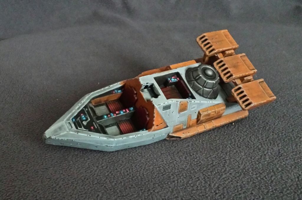
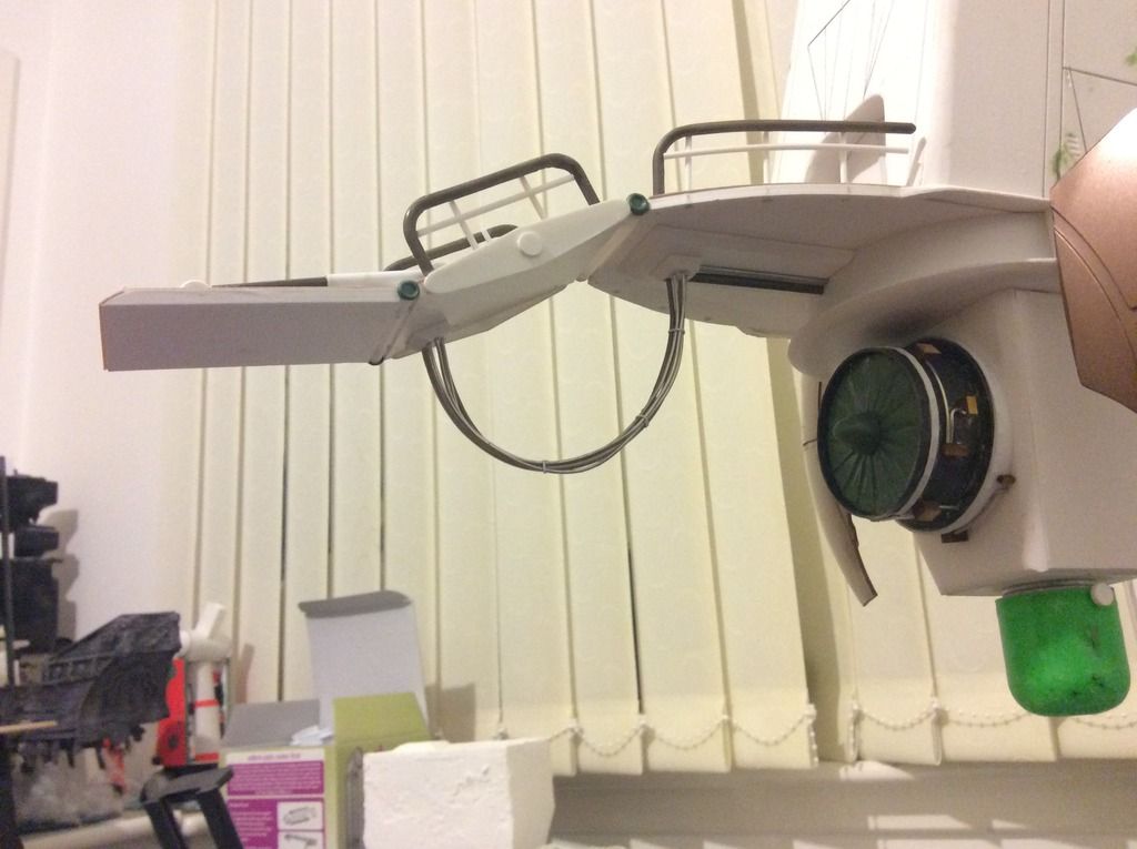
Good grief indeed, that's grand. The new engine works perfectly.
I'm glad you approve Vanvlak! I've still got much more in the way of pipes and stuff to put over it, to make it more look the part.
+1
Right back at you! Did you not fancy joining the comp?
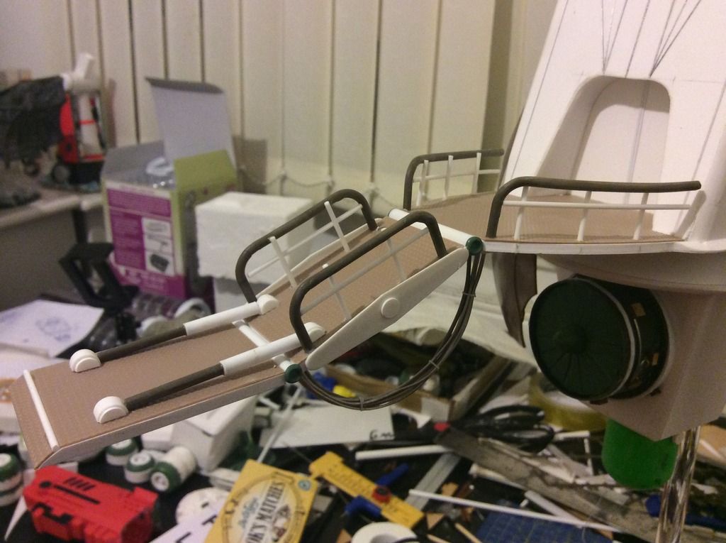
So I've managed a bit more on the ramp at the front. I couldn't find the bits to make it exactly like the picture, but hopefully it looks ok...
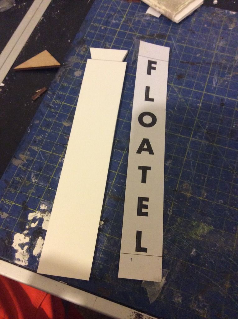
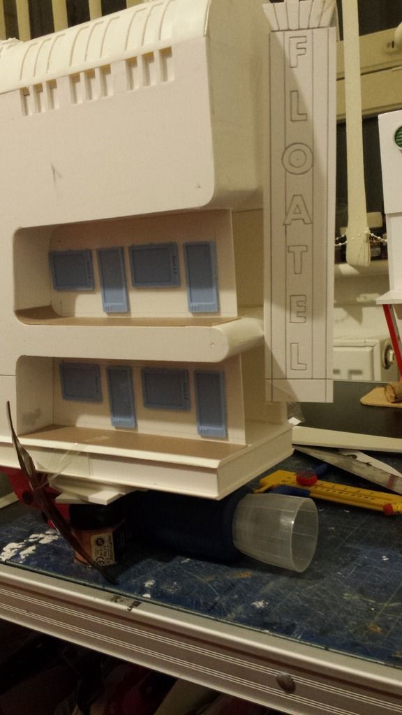
I also thought it might be worth explaining this too. The sign was done really easily. I printed off some basic lettering on my printer then temporarily stuck on to a suitably sized piece of foamed PVC. You then just run a sharp knife around the letterin, effectively cutting it out and marking the foamed PVC underneath. I never even bothered with a ruler on this. Then use a sharp pencil(or pen) to open the cuts up a touch. The hardest part was the "O". It's better having something with less curvy letters!